Let’s talk about how to use colors and emotions to convey feelings through art and design. Are you often stuck wondering what colors to use? How about we employ psychology to help us decide and get the effect that you are looking for?
What is all the fuss about?
Color is a very powerful tool to convey emotions to viewers. It’s one of our main weapons as artists and designers – with proper use we can easily evoke a certain feeling or mood. We actually learn what they mean from the youngest age. When I ask my three year old daughter what color anger is her immediate response is red! Colors can make us feel happy, energized, calm or sad. Understanding what each colors means allows you to create designs more intentionally.
Let’s dive in further. First off, think about what feelings do you want the viewer to have?
Happiness, optimism? Go for bright yellow, orange, pink, lilac, brown
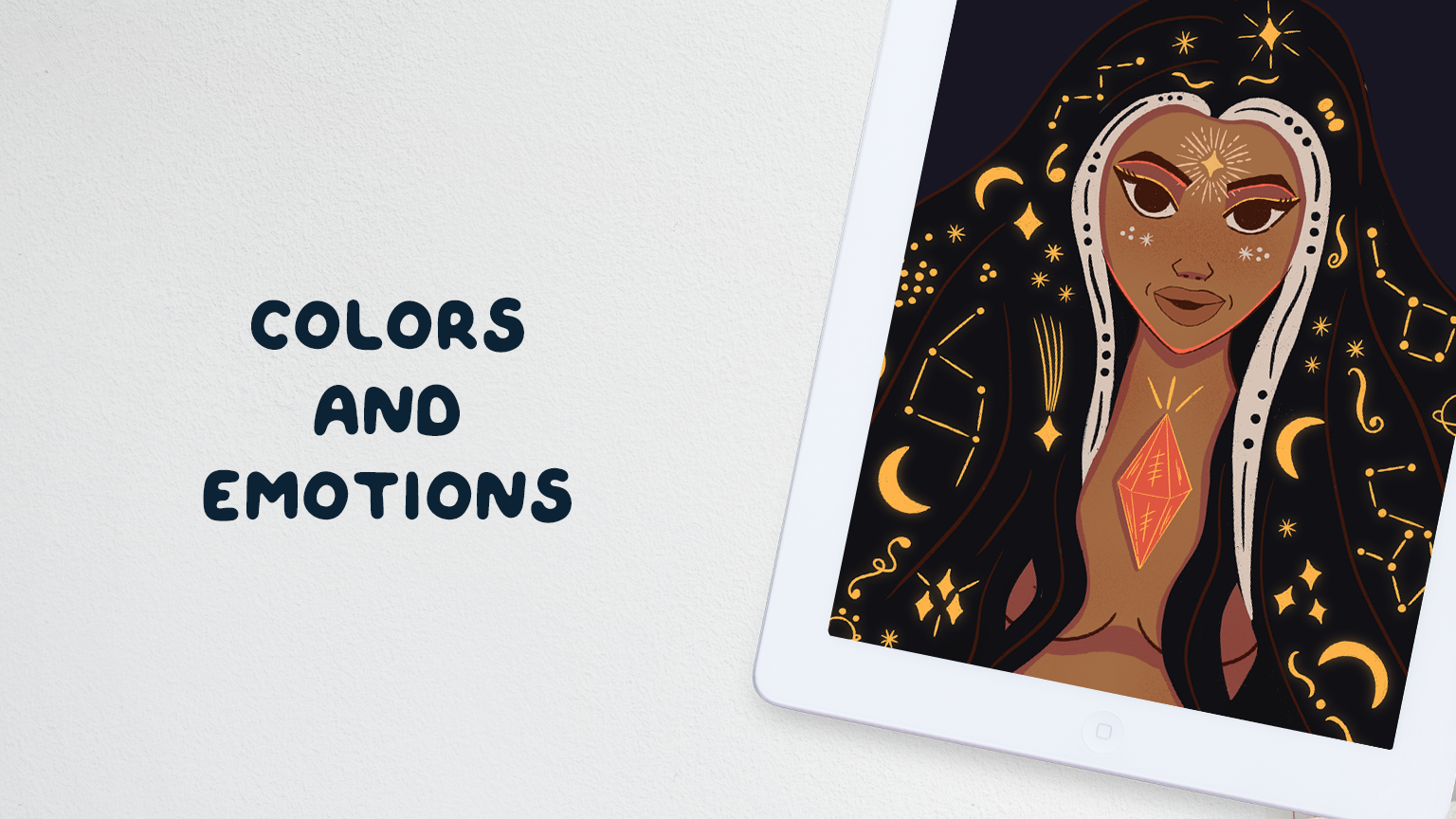
Mystery or passion? Go for vibrant red, purple, black
Calm and security? Go for brown, blue, muted green, light pink, white, grey.
Sadness? Grey, black, muted blue or green
Colors and emotions
Every color has a universally assigned emotion in psychology. However, do keep in mind that in some cultures particular colors can serve a different purpose. In some countries black is seen as color for mourning, while in others white is seen that way. Now that we have gone through the basics let’s see what particular colors universally stand for!
- Red – love, passion, energy, anger
- Orange – friendliness, enthusiasm
- Yellow – happiness, hope, joy
- Green – fresh, health, new beginnings
- Blue – security, tranquility, trust
- Purple – creative, luxurious, mystery
- Pink – playful, romantic, compassion
- Brown – down to earth, stability, dependability
- Black – elegance, dramatic, power
- White – innocence, purity, simplicity
- Gray – security, reliability, calm

Color tones and making it all pop
Another great tip to further emphasize colors and emotions is to look at the tone of colors that you use. If you want a feeling of comfort, coziness go for warm tones. If you want freshness or sadness go for cold tones. It’s all up to you! If you want that extra pop to your piece use an accent color that is in different tone than the majority of the piece. It will immediately draw the eye – however use it sparingly as an accent color so as not to overwhelm the viewer.
To sum up, meanings of colors serve us in the best way possible to further drive the message or emotion we want through our designs. Colors and emotions are interlinked and allow us to universally express our feelings. It’s a very powerful tool to wield and with practice we can easily use it to our advantage. Happy coloring!
Hey, let’s stay in touch!